What is in a chart? At first glance, everything. All that one needs to know.
Right?
No.
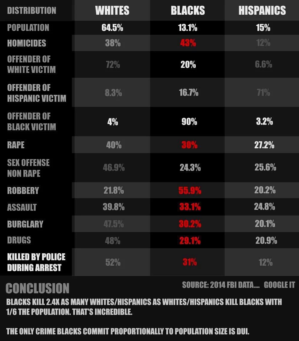
All we see is a representation of a years worth (2014) of collected crime data. No allowances have been made for geography or income. Income, because poverty tends to be a driver of crime rates for any population cohort. I suspect this may help drive up the rates in both the black and the white population. It just shows more for the black cohort, being they have less numbers in which to dilute the statistical average.
Geography also is tied in with poverty to a great extent. But I would also suspect that it ties greatly into police racial profiling as well. Though I know the veins of racial bias run almost everywhere, there are obvious hotbeds.
If I use this chart in the context that everyone else is using it right now (#BlackLivesMatter and unlawful police brutality and deaths), than this chart would seem to have a lot to say. And yet, it has very little to say.
The death by officer rate in the black cohort is high, but as is the white cohort, they say.
When it comes to the white cohort, we again must take into consideration the numbers were dealing with. There are a lot more white people than black people, so of course there will be more whites getting into police confrontations, some of which may not end well. But unlike the black cohort, racial bias typically is not an issue. Income bias possibility, but not racial bias.
The black cohort has more of its population living in poverty, which alone inflates many aspects of this graphic. But they also have the added problem of racial bias and profiling on the part of police ON TOP of everything else. And this is not even taking into consideration the sickness often pervasive within police culture itself. A nasty and toxic ideologically that pits civilisations and police as enemies. It’s a culture that isn’t all that surprising if one considers the many Iraq and Afghanistan veterans returning home and often finding employment in increasingly militarized local American police agencies. But I suspect the roots run much deeper than that.
I will flat out state that I do not know much about this issue. Which is why I’ve skirted it.
But what I do know is that chart data is not always ALL there is to know. Particularly when talking about something as variable as any human population cohort.
